One of my projects this past summer was to go through the all of the records I’ve digitized from Library and Archives Canada and create a database of every PoW Camp (large, traditional camps) and Labour Project (smaller work camps) in Canada during the Second World War. As this is going to be useful (I hope!) for my dissertation and because no one, to my knowledge, has attempted to do so in the past, I wanted to create database that I both could consult as a reference and also map. Today, continuing on this week’s map kick, I decided to see what I could do with the basic tools at my disposal.
Following the Geospatial Historian’s excellent tutorials, I decided to tackle the first lesson on Google Maps Engine Lite. Expanding on Google Maps’ basic principles, Maps Engine Lite allows users to import data and geocode it (taking a place name or coordinates and putting it on a map) while also allowing you to draw vectors and polygraphs. For anyone interested in looking at some basic mapping techniques, I’d highly recommend the tutorial as it was well-detailed and very easy to follow!
Anyways, on to the mapping. My database was based primarily on bi-weekly and monthly statistical reports produced by the Department of Labour that kept track of PoWs employed on labour projects and various statistical reports on internment camps. I should also note that there were gaps in my records that I have yet to fill so it is not a completely accurate depiction of PoWs in Canada. From these records, I was able to obtain basic details such as a general location (usually just a town or city name), the employer, the amount of PoWs employed, the number of guards, the nature of work, etc. As I had already spent the summer entering this data into excel, all I had to do was import the data into Maps Engine Lite and let it work its magic.
Maps Engine Lite, however, is not without its limitations. As my location details were town names rather than coordinates, Maps Engine Lite relies on Google’s data to convert these place names to coordinates. With dealing with 70 year old records, there were quite a few towns or locations that simply don’t exist (and some were just railway stops to begin with). Thankfully, you can go into the data on Maps Engine Lite to tweak the locations to update place names. The other problem I encountered was the limited amount of data that I was able to enter. As Google only allows three layers with one hundred points in each layer, I had to split my approximately 270 points into three different files which wasn’t a big deal but still took some more time.
Now, with all of the data, I used the information I learned from the tutorial to change the colours of the individual points to differentiate internment camps (in red) from labour projects (in various colours depending on the nature of work associated with it). The end result, as seen below, offers me the opportunity to visualize my research in a way that has not been presented before and now I can start looking at the relationships between PoW internment camps and labour projects and their location.
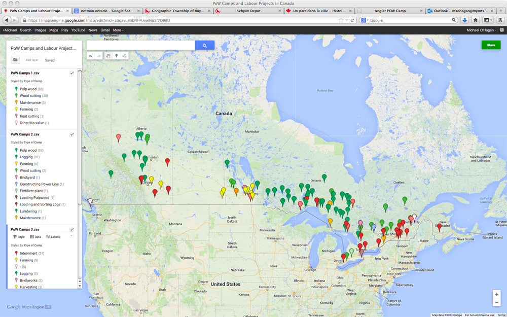
Internment camps are marked in red while labour projects differ by type of work.
As this was only part of the first lesson, I’m looking forward to incorporating this research into some more sophisticated software like GIS and seeing what I can learn from my data!

Wow! Michael! This is fantastic work. Very impressive! Thanks for sharing this on your blog. Great to see what you are doin’ and learnin’ 🙂
Hi Michael,
Very interesting.
Sandy Armstrong
This is fantastic. I’m excited to see what can come from this. Do you think for the benefit of other researchers you would be willing to make the finished product accessible on the web? This could make for an interesting educational site for undergraduate courses or high school classes that touch on POWs in Canada.
Thanks everyone!
Carla, once I get more into my research, I’m hoping to develop a some pages or a website that would have a more interactive and accessible map with a better idea of their locations, more information, and photographs. Hopefully this will spark some more interest into the subject!